Cheat sheet for color combinations. Detailed information about color combinations with examples Color combination map
Scientists have proven that not only a person’s mood is affected influence of a certain color, and also on the state of the whole organism, even leading to changes in the functioning of some of the vital systems. Therefore, color therapy has become widely used in medical practice. For rooms in an apartment or house, the selection of colors is very important. Naturally, you need to be guided by your tastes when choosing colors, but the patterns and tips identified by scientists are also worth paying attention to. When combining colors, there are certain rules of harmony, and each room has its own shade preferences. All this helps to create harmony and comfort in the home.
It is customary to divide all colors into cold, warm and neutral, but the same tones, when presented differently, can create both a warm and cold atmosphere. There are two colors that do not change their rules - blue (always cold) and orange (always warm). An orange interior is associated with a sunny mood, and a blue one with ice. Rooms can be modified and transformed by varying colors and their shades.
First you need to clearly define the purpose of the rooms and then select the necessary color motif. It is believed that soft and calm tones are best suited for children's rooms. The choice of yellow color allows you to adjust the baby’s attention and increase his creative potential. The red color in the interior promotes mobility and active life, but interferes with a calm and quick fall asleep.

As for the kitchen, everything is clear here, since it is a place for preparing and eating food, so it is recommended to use colors that promote appetite and good mood. includes colors recommended for the kitchen: beige, orange, yellow, green. It should be remembered that the use of rich shades leads to a decrease in appetite and even worsening of digestion (of course, this is not an axiom, since each person has his own perception of color).


The choice of colors for the living room should be treated very carefully, because this room is intended for spending time with family and guests, which means that not everyone will be comfortable in an interior that is too bright or dark. It is recommended to choose neutral, non-irritating tones for the living room; this can be any of the colors, presented in a soft or light form. You can add bright details as accents if desired.

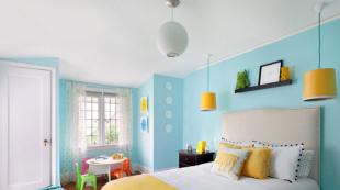
The bedroom is the owner’s personal space, so you can do almost anything with this room and take into account only your preferences when choosing a color (it can be bright red or even black). Still, do not forget that the bedroom is a place to relax, which means that if the interior is in aggressive colors, it will be difficult to sleep or simply relax. Therefore, softness and tranquility should reign here; most often, preference is given to soft bed colors, although purple is not one of them, but it is also good for the bedroom.


The bathroom is most often decorated in white, sometimes with the addition of pale blue; these colors are believed to represent purity.

However, it is not only the purpose of the room that influences the choice of color. The size of the room is the second point that is taken into account when choosing a color for a room. Make a large room bright and cozy, color combination table suggests using warm shades, they also help create a good mood.

To visually enlarge a small room, it is recommended to choose a cool palette in light colors.
To create a comfortable and cozy atmosphere, it is important to use the contrast method and the right combination of colors. It depends on the preferences of the owner of the house what the background will be - calm or bright, but it is better to take one primary color, which will become the leading color and set the tone for the entire environment. Next to the chosen color, you need to select several shades of a different tone. If, for example, red is chosen as the main color, then it needs to be complemented with soft orange or pale yellow, or even beige. There are no special rules regarding decor; the selected accessories can be presented in a wide variety of colors and shades, but the main thing is not to overdo it and not fill the room with all the colors of the rainbow.
A play of contrasts is another interior design option. Each primary color has its own antipodes, so you can achieve a good atmosphere in the room if you make the right combinations (oppose red with green, black with white, pink with light green, lime with purple).
But there are colors that do not get along well with each other. You should avoid combining cold light and warm dark shades, and vice versa. For example, blue (cold light) and burgundy (warm dark). It has been proven that this combination has a negative effect on the psychological state of people. Although now little attention is paid to this and very often they combine incongruous things.
Below is color combination table, which will help you understand the variety of color combinations.
| Main color | Combination with flowers | Doesn't match with flowers | Color influence |
| Grey | Blue, pink, brown, yellow red, black, blue, lilac | Green, orange | Gives the room despondency and sadness |
| Lilac | Grey, chestnut, light purple | red, orange, yellow, brown, black | Mystical, mysterious and mysterious interior |
| Violet | Light green, golden, orange, yellow | Dark green, brown, gray, red | Allows a person to calm down and find harmony of soul. Purple is the color of wisdom and inspiration. |
| Pink | Brown, gray, burgundy | Yellow, orange, black | Romantic interior |
| Brown | Golden, grey, beige, pink, yellow | Chestnut, burgundy, lilac | Causes depression when spending a long time in an interior with a predominance of brown color |
| Blue | Red, grey, burgundy, gold | Green, lilac, brown | Makes the room cool, sometimes uncomfortable |
| Blue | Red, orange, blue, light purple | Golden, light burgundy | Makes the interior cold; if the color blue is too much, scandals occur more often in the room |
How to combine colors in the interior correctly?
Walls are the background that sets the atmosphere of the house, so choosing a color is a responsible matter. Repainting/re-gluing is a rather labor-intensive and not very pleasant process. Therefore, many fears and doubts are born. What if the interior is too dark/cold/bright/sterile? As a result, most people choose the “safest” and most proven option. Most often it is “beige” (What? A warm color that goes with everything). How to stop being afraid of color and how to create a beautiful interior in your favorite colors? What are the rules for color combinations? Let's figure it out. Colorism will help us.
A little theory
The color wheel model, developed by the Swiss artist Johannes Itten, will be an excellent cheat sheet in choosing a harmonious color scheme. Itten's circle consists of 12 parts. This is a table of three primary colors (,), three additional (composite) colors, which are formed by mixing primary (,), and six tertiary colors, formed by combining primary with additional ones. All colors can be divided into cold and warm. Neutral colors (white, ivory, brown,) appear in a separate category. They go well with both other colors from the circle and with each other. Use them as a backdrop for other colors (for example, you can make the walls in neutral shades, but introduce color into the interior with furniture, textiles or bright posters) or add accessories in neutral tones to “dilute” the main color a little.How it works?
Everything is very simple. There are only six canonical schemes (selections) of color combinations in the interior. Let's look at them with examples.1. Analog triad
 This is the simplest and “safest” option. Take 3 consecutive colors from the palette. Use shades of these colors in your interior design and you are guaranteed a calm, beautiful interior.
 2. Complementary combination
 Colors located at diametrically opposite ends of the circle are called complementary. One of the colors will be the main one; a contrasting color can be used to highlight interior details. If you are afraid that it will be too bright, dilute the room with neutral colors to a level that is comfortable for you personally.
 3. Contrasting triad
 This is similar to a complementary combination, only two adjacent sectors are added to one of the colors. Decorate your apartment in these colors, and leave the contrasting one for small interesting details. Or, on the contrary, make one color the main one, and use the other two, closer ones, for accents.
 4. Classic triad
 This is a more complex option. A combination of three colors equidistant on a circle. Here, one color is usually taken as a basis. The other two are used for emphasis. If you are afraid that it will come out too colorful, dilute it with neutral colors “to taste.”
 5. Rectangular/square pattern
 Use two pairs of contrasting colors. It is important not to overdo it, otherwise the interior may turn out to be colorful. It would be more correct to choose one main color and three additional ones.
  The square scheme is a variation of the rectangular one, but the colors used in it are located in a circle at an equal distance from each other.
  This scheme is not suitable for everyone. Interiors with a lot of colors turn out to be bright and interesting, but over time they become tiring. This approach is a good way to design oriental interiors or interiors in style boho.
Could it be simpler?
 Can. If combinations from a circle are still scary, the simplest and safest option is to choose one color and combine it with neutral companions. It will turn out simple, stylish, minimalistic and modern.
 Dark-light
We finally decided on the colors. But how to choose the right tone? Dark? Light? And how to combine them? Shade compatibility depends on the task. You can, for example, take selected colors in very light tones. The interior will be light and delicate. This is an excellent solution for children's design.
  Or you can use the most saturated colors. This will make the room bright, atmospheric, inspiring and energizing, so this option is not very suitable for the bedroom. There it is better to use calmer tones.
  Or you can take one or several soft shades and one rich one. The colors “work” together, complementing and highlighting each other. Against the background of delicate pastel tones, the bright color will sound completely new. Try it!
 Color combination in the kitchen

It is best to choose warm colors for the kitchen. For example, orange, yellow and red - they improve mood and improve appetite. They can be used as an accent on one of the walls, an apron, and also on appliances, furniture and accessories. Neutral white, beige, gray and black are good companions for such bright, cheerful shades.

If the kitchen windows face south, it is better to avoid too warm colors, as they increase the feeling of heat and stuffiness. Pay attention to the equally winning combination of brown and green. It creates a cozy atmosphere and makes us a little closer to nature.
Color combination in the bedroom

The color scheme of the bedroom should help you relax and fall asleep after a hard day. Pastel colors contribute best to this. Pay attention to colors such as milk, gray, sand, chocolate, gold, delicate lilac, blue, pink, etc., which can be harmoniously combined with each other.
Color combination in the bathroom

The bathroom is where we start and end our day. It is important to find a balance here and choose a color scheme that will invigorate and delight you in the morning, and relax and soothe in the evening. The most popular solutions: white with blue or blue, white with beige and gray, white with chocolate. But it is better to avoid green - in the bathroom it will be associated with mold and dampness.

As a rule, the footage of a bathroom is not large, so it is worth abandoning the abundance of too dark or bright colors, which visually reduce the space. Instead, there are light and muted shades with a couple of catchy accents.

There are millions of successful combinations for a cozy and beautiful home. Bright, juicy, tender, airy, inspiring, bewitching. Do not be afraid! Experiment! Even if suddenly the chosen color on the walls does not turn out to be ideal, this can be corrected. Choose accessories in a matching color or “dilute” with large accents in neutral tones. Use the tips in this article and surround yourself with your favorite color. This is better than “beige”, right?
Dressing monochrome, when all the details of your toilet are the same color, has long been a sign of bad taste.
There are few exceptions to this rule - if you are not a bride or in mourning, then your clothes should contain three shades - the main color, an additional color that harmonizes and shades the main one, and, possibly, a contrasting detail, an intriguing color accent.
Selecting and combining them correctly is often a very difficult task. We already talked about this in the post
There are colors that are most flattering for you. And their skillful combination with the rest creates the concept of elegance and taste. A lucky few, naturally endowed with a subtle artistic taste and color perception, can choose the color scheme for a wardrobe, relying on their intuition. For everyone else, in order to always be stylishly and tastefully dressed, you need to learn a few rules.
White color goes with all colors. White lifts the mood and is used to treat diseases of the central nervous system. White is the color of purity and clarity. The color of justice, faith, innocence and beginnings. This is a blank slate from which history is written. By giving it preference in clothing, you are entering a new time for yourself. It is better suited for creating contrast than any other.
White and black are the best combination of colors in clothes: photos of women in them always look solemn. When combining it with other colors, it is worth considering the fact that white casts glare and visually enlarges things.
Beige color combination table
Beige color boldly combines with calm tones, and can also be perfectly combined with richer and brighter tones. Beige color is combined with colors: khaki, marsh, cocoa, gray, taupe, chestnut, chocolate, yellow-green, olive, rusty brown, terracotta, eggplant, purple, bright blue.
 |
 |
 |
 |
 |
 |
Pink color combines with white and soft blue, with light gray, intermediate between red and white tones.

Red color combination table
Red color combines with yellow, white, brown, blue and black, lilac and pink, black and silver, black-brown and sand. Red tones are now boldly mixed with each other, and look stunning at the same time. A more moderate option is to combine red with black.
 |
 |
 |
 |
Bordeaux color combination table
Bordeaux- the color of a woman who knows her worth. Bordeaux goes well with black and dark blue, as well as with colors: green, olive, gray, blue-green, tomato and other shades of red. Berry tones go very well with Bordeaux: blackberry, blueberry, elderberry.
 |
 |

Raspberry color combination table
Fuchsia, crimson, purple colors combined with colors: yellow, orange, dark green, green, bright blue, purple. Raspberry color also harmonizes well with pink and white colors.
Coral color combination table
Coral color has twelve varieties, these include pink-orange shades and rich red-orange. Combines with colors: white, beige, gold, nude, brown, dark brown, khaki, shades of gray, scarlet, pink-peach, lilac, lilac, hot pink, orange, yellow-orange, pale yellow, dark blue , gray-blue, black.

Yellow color combination table
Yellow- represents the sun, wisdom, fun, self-confidence and freedom. Golden color- This is the color of fame and wealth.
Yellow color goes well with colors: marsh, blue-green, orange, warm brown, chocolate, black, dark blue.
Golden color goes well with colors: olive, brown, red, purple, dark green, violet.
Yellow color - with blue, violet, lilac, turquoise. Yellow color without decoration or addition to it is unattractive.
 |
 |
Orange color combination table
Orange color- cheerful, bright, summer and positive color, dynamic and ethnic, the color of the brilliance of the setting sun.
Bright orange color goes well with bright colors: bright yellow, mustard, beige, purple, brown. Muted orange or terracotta goes well with calm shades - pale yellow, gray-green, khaki, brown, chestnut, chocolate, navy or taupe.
Contrasting black goes well with orange and yellow.
 |
 |
Brown color combination table
Brown color goes with sky, cream, yellow, green and beige, denim blue, smoky blue, light green and white; the color of May grass and very light green, lilac and faded pink.
Brown color goes well with olive, gold, blue-green, orange, lilac, light pink, all shades of beige, ivory and gray. And the unexpected and extremely successful combination of warm brown and turquoise will make an excellent impression.
Rusty brown combined with plum and brown; purple with orange and creamy white; light green with camel; red with yellow and creamy white; brown with blackberry.
 |
 |
 |
 |
Green color combination table
Green color- with brown, orange, light green, yellow and white flowers and only light greens - with gray and black tones. It is intermediate between cold and warm tones.
 |
 |

Olive color combination table
Olive color harmonizes with colors: blue-green, warm green, khaki, apple green, herbal, eggplant, burgundy, cherry, purple, dark purple, brown, golden, red, orange.
 |
 |

Mustard color combination table
Color of mustard goes with colors: brown, chocolate, terracotta, yellow, beige, khaki, blue-green, coral, hot pink.
|
|
 |

Blue color combination table
Blue color goes with orange; brown and peach, khaki and faded orange, creamy white, blackberry with splashes of brown, light brown and tomato; greyish-orange and purple.
Combine night blue with caustic pink and pine green; red and white; pale pink with dark brown and silver; May greens with blue-green; gray with bright yellow and pale pink.
Blue color comes in light and dark tones.
Light blue- with white, yellow, orange, pink flowers, is intermediate between red and blue.
Dark blue- with light blue (cyan), gray, red,
denim blue, smoky, plum blue; with green and white; gray, light pink and brown; pink and green-blue; vanilla yellow and light blue; dark brown, purple.
 |
 |

Blue color combination table
Blue goes with colors: pink, lilac, coral, light purple, yellow, bright blue, dark blue, gray, white, beige.
Turquoise combines with white, yellow, orange, purple, blue-green.
 |
 |
Table of combinations of purple and lilac colors
Purple- the color of nobility and luxury. Pairs best with blue.
Purple- with white, yellow, orange, pink colors, is intermediate between red and blue.

Light shades of purple are called lilac. They are combined with yellow, orange, gray and white colors.
To lilac color They include the colors of violets or dark lilac inflorescences, violet. Lilac is the color of femininity and is associated with sophistication, grace and elegance. The color lilac goes best with dark neutral shades - black, gray or dark blue.
Purple colour and all its various shades are considered one of the sexiest, mysterious, mysterious and sensual flowers.
Lilac color goes well with colors: pink, white, blue, lilac of a darker or lighter shade, lemon, the color of a withered rose, silver shades, blue, cornflower blue, lilac and violet.
Lilac pink goes well with lavender and dark blue; dark brown with pink-red; brown with light brown; silver with denim blue and yellow, goes well with lavender.
|
|
 |

Gray color combination table
Grey colour- the color of elegance, intelligent, harmonious, calms contrasting combinations, used in a business dress code. Light gray looks good in the finest natural lace or sensual silk, graphite gray in suede, and smoky gray in fine wool.
Gray color is boring, so it is better to combine it with contrasting colors: white, blue, black, burgundy, red. For an elegant outfit, it can be combined with other shades of gray, lighter or darker, and even beige. Light gray color is best combined with pastel colors: soft pink, yellow, lilac, blue, purple, coral.
Gray-blue goes well with ocher, white and brown; with brown and beige; with purple and pink; with lobster red, turquoise and white; with silver and blue; with May greens and white.
 |
 |
Apricot blossom goes well with camel and brown; light brown, beige and splashes of pink; gray-blue, blue and ocher; sky blue; green, white and silver; red and white.
Camel color combines with gray-blue and purple; beige-brown, blue and lilac; ocher and brown; yellow, red and white; green and white; lobster red.

Khaki color combination table
Khaki combines with gray-orange and tomato; lobster red and white fur color; blackberry, plum and yellow-gold; golden and blue-green; red, soft green and peach; purple, red and peach.
 |
 |
 |
 |
It's even better if you pair a solid khaki with a printed garment in these vibrant colors.

Black color, white and gray color
Looks good black color


Here are examples of some successful color combinations
1.
light and dark olive, dark pink and magenta

2.
burgundy, dark blue, black

3.
pink, blue, sepia tones

4.
light blue, blue, beige and dark brown

5.

6.
ash pink, anthracite, blue majolica, ocher
A rare example when light contrast in an active multi-color combination looks organic: 
7.
shades of beige and brown, ash lilac, gray

8.
blue, dark olive, dark blue, deep purple

9.
Two looks are based on the same color combination - terracotta, khaki, turquoise, nude
10.
terracotta, carrot, dark cherry

11.
cherry, blue and plum, complemented by achromatic shades

12.
indigo, lingonberry, dark orange and burgundy

13. taupe
, burgundy, dark orange and brown

14.
plum brown, cinnamon, dark olive

15.
saffron and turquoise with red-brown shades

16.
mustard, burgundy, dark orange,
taupe

Avoid:
Green and with blue, orange.
Brown and black, bordo, lilac, pink. Red Andpurple, brick, orange, olive, pink, brown, chestnut.
Pink and with blue, olive, red, chestnut, ultramarine, lilac.
Orange And purple, red.
Dark blue and black, sgreen, pink, brown.
Fpurple and with lilac, red, brick.
Lavender and parma color.
Golden And pink, lilac
Yellow and burgundy, pink.
Grey And brown, beige.
Black, white and gray often used as decoration.
Looks good black color in the vicinity of orange, yellow, pink, red, lilac and salad tones, with caustic pink, gray, lemon, indigo, gray, lush green with azure, pale green with bright green.
General rules for combining colors in clothes
The right combination of colors in clothes will make your look complete and harmonious. General rules say that this can be achieved by combining:

- contrasting colors, for example, cherry - pink, blue - cornflower blue, lilac - lilac, green - light green. Such combinations are used in various types of clothing.
- P olutonal colors, for example, soft pink - soft blue, soft salad - soft lilac.
- solid colors, for example, brown - beige, light red - dark red. Such combinations are used in everyday clothing and clothing for overweight women.
All pastel colors are combined with each other, regardless of shade.
Pastel colors- beige, peach, pink, light blue, etc. Those. all colors that add a lot of white. These colors can be combined with each other in any order. Be careful with pink - the only color that is fattening.
Use from 2 to 4 colors. If you use only 1 color, it creates a feeling of dullness and paleness. If you use more than 4 colors in your clothes, then when they see you, people's eyes jump from one color to another, not knowing where to stop, which unconsciously increases anxiety.
Can be combined with each other either related or contrasting colors. All other options are inharmonious.
Related- these are colors that differ from each other in shade (red, pink, dark red).
Contrasting- these are colors that are completely opposite (purple - yellow, blue - orange). The only contrasting combination that is risky is green and red. You can find out which colors are related and which are contrasting using the color wheel.
Choosing the right color of clothing and correctly putting together a style ensemble is a very difficult task, but very necessary. The ability to do this stylishly and successfully will save you from questions about whether this scarf will suit my look, what jewelry to choose today, whether my bag matches my shoes, etc. It would seem that such simple questions, but they require solutions every day. Just look at these diagrams like a cheat sheet - and everything will be fine.
Based on materials from izuminka-club.ru, fashion-fashion.ru
: "What to wear with a red skirt, purple boots or an orange sweater?" - one gets the impression that most girls are sure that there are some secrets and rules that only a select few know and according to which certain colors are combined strictly with certain ones. If you also think so, then you, at a minimum, don’t know a lot of things and are needlessly complicating everything.
ALL colors go together!
The rule is simple! But there are nuances.
ALL colors and shades of the same temperature are combined. That is, warm with warm, and cold with cold. And if you don't know, each color has a cool and warm version. If you know how to distinguish them, then combining colors turns into a fascinating game, your wardrobe becomes bright, stylish and colorful, and you can dress with your eyes closed! This saves time on getting ready in the morning before your wardrobe explodes with the number of unnecessary things, saves money that you will no longer spend on things that don’t suit you (!) and distinguishes you from the gray-black crowd.
It takes practice to learn to distinguish the temperature of shades! After all, “to know” does not mean “to be able to.” You can know that the car is running. It only takes a couple of seconds to learn about this fact! But it will take you longer to learn how to drive it, right? If you don't practice, you won't learn. It's the same story with flowers.
You can practice at an online school, and at the same time learn how to combine all the colors in the world beautifully so that you can immediately apply new skills to your wardrobe, banishing gray and black from it :) After all, spring is coming and you urgently need to clean your feathers and be the brightest and most beautiful of all!
So we are waiting for you at the style lessons at the Shopping School, but in the meantime we invite you to admire the selection of combinations of cool shades! Surely, there are things in these colors in your wardrobes. And if you didn’t know what shades you could combine them with, then these ideas will definitely come in handy!


When thinking through the design of any interior, you should carefully select the color scheme. It is she who has a powerful psycho-emotional and energetic influence on a person. Therefore, it is important to choose exactly those colors that will bring harmony to the atmosphere of your home. In this process, it is necessary to correctly use the combination of colors in the interior: a table of harmonious combinations will help turn even an ordinary room into an absolutely flawless place.
When creating a design, you need to start not only from your preferences, but also follow certain rules. Compliance with them will ensure results of a higher level. Many experts develop on this basis the whole science of coloristic design of premises.

The main supporting points are as follows:
- a correctly chosen base is the foundation for further decoration;
- all colors are divided into two groups - cold and warm colors, which must be taken into account when combining them;
- Warm colors will add coziness to a large room;
- a small area will be visually enlarged due to the cold palette;
- when choosing shades for kitchen design, you should remember the statement that some colors can increase appetite, while others, on the contrary, will suppress it;
- the color palette of the bedroom should promote relaxation - both moral and physical;
- the choice of colors for the living room is selected to satisfy most preferences;
- the choice of style is the determining basis for what colors to use;
- It is advisable to think through everything as thoroughly as possible: color can change the overall picture, both for the better and for the worse.

Style color combinations and their influence on a person’s mood
Each style has its own defining tones, so when using a certain style direction in your design, you should take into account the correspondences given in the table:
| Style | Color |
| Provence | Light pink, milky, blue |
| Eco style | Swampy and brown |
| Baroque | Pastel shades |
| Classical | Mandatory presence of white |
| High tech | Metallic grey, black, white |
| Modern | Brown beige, blue, green |
| Minimalism | Black and white |
| Futurism | White, lemon yellow, ultramarine, light green |
| Pin-up | Light pink and warm yellow |
| Country | Sand, light yellow, brown |
| Loft | Orange, red, blue, green |
Following these dependencies will prevent you from making a serious mistake during your work.

We should also not forget about the influences exerted by certain colors:
| Hue | Impact on a person's mood |
| Shades of yellow and green | Optimism, calm, tranquility, reduction of fatigue, relaxation |
| Pastel colors of yellow, beige | Creating comfort, peace of mind, making compromise decisions |
| Turquoise | Feeling of lightness and freshness |
| Blue | Calmness, peace, good sleep |
| Yellow and orange | Warmth, comfort, tone of the whole body, stimulation of active areas of the brain |
| White | An excellent background for any design solution, cleanliness, order, inspiration, but its abundance brings coldness to the room |
| Black | Suitable for graphic types of interior, can add gloom and gloominess |
| Grey | Always looks businesslike, regardless of the use of bright accents |
Color wheel of color combinations: basic principle of use
To successfully select the design of any room, use a circle of color combinations. Its structure consists of 12 sectors. Each sector contains one color, or rather all its shades. Graduation occurs from a light tone in the center to a dark tone at the edge of the circle.
The spectrum begins with three primary colors: blue, yellow and red. Further, when they are mixed, secondary shades appear: purple, green and orange. Accordingly, the secondary and primary colors are then mixed, and as a result, tertiary combinations are obtained.

Using this circle you can choose a color palette in several different directions:
- Solid type.
- Complementary combination.
- Harmonious type.
The monochromatic type is based on the use of only one color segment. The combination of colors with each other here occurs from light to dark shades of the same color. This monochrome approach is quite rare. It is not always possible to do without any contrasting inclusions.
The complementary combination gives a very high-quality, bright design. Using colors that are diametrically opposed, small compositions are created, but the necessary accents are very effectively placed. For example, the following pairs are used according to this principle:
- combination of turquoise color in the interior with red;
- combination of purple and yellow-green;
- a combination of green and red-violet in the interior.

Classic combinations: a base of three and four colors
The harmonious type is based on the use of one main, two supporting and one additional - black or white.
The main variation of this approach is the triad. The combination of colors on the color wheel is based on the use of 3 equally spaced colors. In the photo of color combinations in the interior, you can note the choice of one main and 2 supporting shades. Such a connection is often found not only in works made by man, but also in the wild. This proves the absolute correctness of its use.
As an option, many are considering an analog triad. Take 3 colors located next to each other on the circle. One is the main one, the second is supporting, the third is accentuating. In the future, based on this principle, a very correct design line is built.
Separately, it is necessary to mention the contrasting triad. Here you need to take the main color and find its diametrically opposite one. But in combination with the main thing, add not it, but two colors adjacent to it. The result will be a softer, less flashy use of tones.
There are correct combinations based not only on three colors, which are called triads, but also on four. A rectangular scheme is known in which the colors are complementary in pairs. In this option, 1 is the main one, and the rest are auxiliary. For example, good combinations of beige in an interior with other colors are blue, brown, and emerald.

Another option will lead to a good solution: using colors according to the square principle. This action is similar to the previous one, but the only difference is that the colors are equidistant from each other.
Combination of colors in the interior: table, basic rules and directions
To create a fashionable image of your home, you need to have a basic understanding of color combinations. Using the color wheel is not always easy to use. Therefore, they often resort to the help of certain tables, in which you do not need to calculate anything yourself, but everything has already been selected by specialists. Therefore, you can easily determine the most original combination of colors in the interior of the living room or in another room.
Such tables can be presented in the form of a large set of colors, between which the degree of compatibility is noted. Having independently combined two shades, you can already see whether it is worth using them or whether you need to think about a more correct choice.

There are also tables that contain ready-made solutions. This is a collection of four tones that combine most successfully with each other. Using such simple examples, you can easily choose the most harmonious option for any room. Their construction is also based on the colors of the color combination circle.
Some charts on the left contain the main base shade arranged vertically. Next, there are several color ranges: possible shades of the same color, possible shades of other colors and several contrasting shades.
Examples of table combinations
The combination of turquoise color in the interior with other shades in the form of ready-made tables can be presented with certain names, such as “summer dreams”, “meeting in a coffee shop”, “lime kiss”, etc. This color is able to softly and unobtrusively highlight the necessary details premises. The variety of its shades from dark azure to delicate aquamarine gives designers a wide field for action.
The combination of green color in the interior can also be found in the form of ready-made solutions. If, for example, we take a light green shade, then an excellent result will be obtained when used with eggplant, purple, burgundy, warm yellow and orange shades. Recently, a delicate mint tone has been very popular, which harmonizes perfectly with white, silver and light brown tones.

If you take deep and rich dark green as a basis, then it will already be combined with cool shades of red, lemon yellow. The dark olive shade of the walls is good in combination with the colors of curtains and wallpaper in a dark brown or white shade with contrasting accents of pink.
Using such simple ready-made combination tables, the result of interior designing any room will be very good, even without the additional help of specially trained designers.
Color combinations in the kitchen interior: photos of successful ideas
Well-thought-out components of kitchen design will give the most positive result. Here you need to take into account the decoration of the walls, ceiling, floor, and selected furniture. The main criterion for selecting the above parameters will be the color scheme. In this matter, experts most often come to the following decision: if the walls are made in bright, provocative colors, then the kitchen furniture should be made in calm, bed colors. And vice versa.
Wood-like designs for kitchen units are often used. In this case, a good combination of colors in the interior with brown would be cream, pink, bright blue, green and beige. Based on the choice of such a palette, you can distribute the colors you like between the decoration of different parts of the room.
Recently, high-tech kitchens have become especially popular. The base color of this design is grey. Despite the fact that it is considered boring and purely businesslike, dark pink, red, purple and bright blue are a wonderful combination of colors with gray in the interior.

Important rules when planning a kitchen interior
Creating a design for a specific line is based on several rules:
- Having chosen the main color and its complementary colors, you should remember that it can look different on different surface textures;
- contrasting colors are very often used to zone a room;
- in order to diversify a monochromatic interior, they resort to drawings, lines, and geometric shapes.
Related article:
Professional advice for those who do their own repairs. Preparing walls for painting. Selection of trendy colors and textures.

Wanting to have a catchy and slightly defiant design, contrasting colors are used. But when decorating, you always need to feel a fine line, otherwise you may not avoid bad taste. The use of contrasting accents always makes the environment bright and impressive. For example, a combination of blue and metallic colors will highlight black. Even considering that he is deep, strict and sad, he will fit perfectly into this triad.
Helpful advice! The main basis for choosing a palette should be the following thesis: furniture is always darker than the walls, but lighter than the floor.

In addition, you need to remember the following correspondences:
- orange goes with blue and gray;
- red - with white, gray and black;
- yellow - with purple;
- blue - with peach;
- lilac - with green.
After this, the full scale is built. Photos of color combinations also show that glossy surfaces expand the saturation and depth of tones, while matte surfaces do the opposite. Using this fact, you can effectively play on the variety of materials offered and achieve the most desired result.
Combination of color with other colors in the living room interior
The directly proportional relationship between the interior and the purpose encourages the correct selection of colors for the living room. If it is used only for receiving guests and family gatherings, then it would be best to use shades that promote long-term communication, leisurely and naturally flowing relaxation, and a fun event. This room sets the overall balance of beauty and comfort in the house, and therefore requires increased attention when decorating.

Helpful advice! Red tones with gold will give a feeling of celebration, green and olive - a craving for intellectual games and reading. The color combination of purple and, for example, gray will set certain accents and enliven friendly gatherings.
But the central room of a house or apartment cannot always be used only for its intended purpose. Very often, it also advantageously combines the functions of a bedroom.
In this case, the owners have to find the ideal compromise in the design solution. Depending on your temperament, you can choose good options. However, we should not forget about the influence of color on sleep and rest. More restrained tones, combinations of beige in the interior, turquoise, lavender, emerald and azure will give a feeling of complete relaxation in the bedroom and at the same time will look harmonious in the living room.

If the walls are beige, the combination of colors in the living room interior will be an easy choice for the owners. After all, the basic beige shade is the ideal basis for almost any color scheme. You can choose a lot of options in any direction. This approach is very often used due to its versatility. In a situation where one room is used for different functional loads, it requires clear zoning.
To avoid unnecessary overloading of space with various racks, niches or screens, it would be correct to use a color palette to distribute the territory. This tactic is very often applicable and is famous for good feedback about itself. After all, how nice it is to be in a room in which everything is free and at the same time clearly structured.
Photos of wallpaper combinations of two colors in the living room clearly demonstrate the possibility of zoning a room to increase its functionality. And at the same time gives it a special feature. Beautifully selected tones with this technique will make the interior original.
Color combinations in the bedroom interior: colors and successful combinations
It's no secret that good proper rest is the key to health. To ensure this important part of every person’s life, a room is required that best satisfies his individual needs.

It is necessary to design it so that it is comfortable, pleasant and conducive to relaxation. A table of color combinations in the interior will give you the opportunity to choose the right options. Depending on personal preferences, cold or warm tones are used, often resorting to the so-called color bleaching. This practice makes your favorite bright, flashy shade more suitable for the rest room.
When choosing, you need to remember that the number of colors cannot exceed 7, while everything is taken into account: the color of the ceiling, furniture, accessories, etc. The percentage of bright colors is 10. The more colors there are for decoration, the less bright they should be .
Bright style in the bedroom: the right tone solution
A photo of color combinations in a bedroom interior shows that using even deep red is well suited for creating a modern design. This option will appeal to people with an active lifestyle. If you diversify this color a little, you can get another very fashionable look, which is based on the terracotta shade.

Based on these tones, many often resort to using golden touches. A tandem of red and dark green will give a very good result. The combination of gold and brown will add depth and importance to the bedroom.
If you like the color red, but want a calmer atmosphere, then you can safely use scarlet or ocher. By combining with basic colors of a pastel nature, you can achieve both a bright accent and pious depth.
Use the color of cheerfulness and fun - orange - in the bedroom with caution. It is suitable for many active and mobile people. Related tones such as pumpkin or tangerine are ideal for the dominant color. Look good in combination with ivory or beige.
If the choice clearly fell on the color yellow, then you need to approach the issue very carefully. Specialists from design companies do not recommend using it as a local one. It would be best to use a pear or corn shade.

Peace in the bedroom: how to achieve it with color
Most people tend to perceive the bedroom as a center of calm and tranquility, so they do not use bright, saturated colors when decorating it. The choice most often falls on pastel colors. They contribute to practical rest and full restoration of physical and emotional strength.
Blue color is ideal for decorating recreation rooms. It is boldly associated with water and its natural purity. According to the color combination table, it looks good with natural shades of wood and beige.
A surge of vigor and purity of thoughts will be fully ensured by green color. Using it as a base when decorating a room, you can easily achieve this effect. To prevent the room from seeming a little boring or gloomy, you can combine this color with neutral shades such as white or light beige.
The combination of brown in the interior with beige, green or purple will add some mystery. The room will be cozy and calm. It is the brown shade that is chosen as a priority, and the rest will play a supporting role.

Many pastel shades go very well together because they complement each other. Beige, cream and apricot carry positive energy. They often act as the basis of a design line and are well set off by other colors that act as bright contrasting accents.
A high-tech style solution would be a combination of colors with gray in the interior. It would look perfect with the aforementioned red. It has been very common lately to combine gray and lilac colors into one semantic picture. Such a combination will be perfectly set off by a furniture set in white or dark brown.
The gray shade itself can play a dual role in any design. Where necessary he will emphasize the brightness of another, and where necessary he can dim it. Colors such as blue, green, pink or beige will also help him create a comfortable atmosphere in the bedroom.

Note! The combination of gray color in the interior fits well into various style solutions. That is why it is in great demand among owners of modern apartments.
The combination of colors in the bedroom interior can be different, but there are also moments that should be avoided. For example, contrasting solutions are a little inappropriate. Options such as orange and purple, yellow and blue, green and purple are not suitable for the interior of a relaxation room. Their combinations are very colorful and provocative, and will not give you the opportunity to relax and unwind. Therefore, thinking through each step, you need to correctly analyze the situation and choose harmonious combinations.